A bubble plot positions points by two quantitative values and uses the size of each circle to encode a third. It is a scatter plot with an added magnitude dimension.
- Good for: comparing three numeric measures at once, spotting outliers, correlation with a magnitude (for example, revenue vs. profit sized by order count).
- Not great for: part-to-whole composition (use a sunburst or treemap), category magnitudes without x/y coordinates (use a packed bubble chart), or time series.
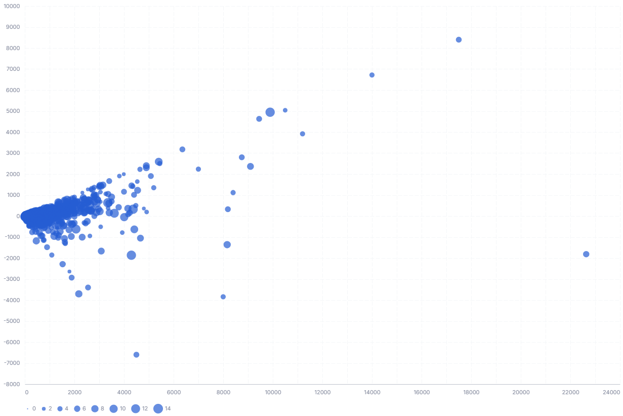
A Bubble Chart expects four fields. Each row of input is one bubble, identified by its category.
| Field | Label | Type | Role |
|---|---|---|---|
x_axis |
X-axis | dimension |
Horizontal position; read as a quantitative value. Sorted ascending (apply_order: 1). |
y_axis |
Y-axis | dimension |
Vertical position; read as a quantitative value. Sorted ascending (apply_order: 2). |
size |
Size | dimension |
Bubble area; larger values render as larger circles. Sorted ascending (apply_order: 3). |
category |
Category | dimension |
Names each bubble, colors bubbles by category, and is the field a click cross-filters on. |
Data requirements: Pre-aggregate to one row per bubble; the template does not aggregate, so each input row draws its own circle. Use numeric values for x, y, and size (all plotted as quantitative); category is a nominal label.
| Option | Default | Effect |
|---|---|---|
show_tooltip |
true |
Shows a tooltip with x, y, size, and category values on hover. |
- X, Y, and size must be numeric. The template encodes X, Y, and size as quantitative, so non-numeric values for those fields will not plot correctly.
- Rows are not aggregated. Duplicate x/y points each draw a separate overlapping circle, so pre-aggregate before charting.
💡 Import this data into Holistics to use: disasters.csv