Hi, thanks so much for this. It helps OpenMW a LOT, and it must have been a huge amount of work.
I don't have vector font design training or experience, but I have tweaked "o" to be less slanted in the center (looks closer to original).
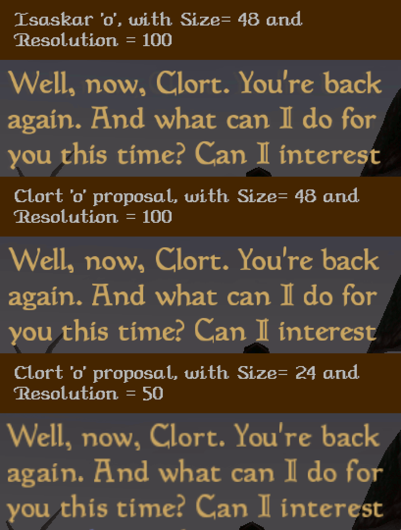
My changes seem to have affected spacing between 'e' and '?' but i don't know why. Fontforge also gives errors on exporting font - so this shouldn't be considered release-quality.
But -- If you could take a look and see if you think something close to this would be an improvement, that'd be great.
Some other notes:
-
"f" - Bottom tip is a bit narrow maybe? I made the point slightly less acute.
-
"t" - I think the bump on the upper-left side needs a bit of convex curve, not diagonal line down to the left.
-
"k" - top diagonal made a bit steeper
-
"I" second line a bit lighter, but it doesn't really show at game resolution.
-
At scale 1.8, the font looks sharper with increased resolution in openmw_font.xml. I prefer it sharper, but maybe it is too sharp for some tastes?
Pelagiadd.ttf.zip
Cheers Isaskar!
Hi, thanks so much for this. It helps OpenMW a LOT, and it must have been a huge amount of work.
I don't have vector font design training or experience, but I have tweaked "o" to be less slanted in the center (looks closer to original).
My changes seem to have affected spacing between 'e' and '?' but i don't know why. Fontforge also gives errors on exporting font - so this shouldn't be considered release-quality.
But -- If you could take a look and see if you think something close to this would be an improvement, that'd be great.
Some other notes:
"f" - Bottom tip is a bit narrow maybe? I made the point slightly less acute.
"t" - I think the bump on the upper-left side needs a bit of convex curve, not diagonal line down to the left.
"k" - top diagonal made a bit steeper
"I" second line a bit lighter, but it doesn't really show at game resolution.
At scale 1.8, the font looks sharper with increased resolution in openmw_font.xml. I prefer it sharper, but maybe it is too sharp for some tastes?
Pelagiadd.ttf.zip
Cheers Isaskar!