Compare two price or NAV series of a Polars DataFrame, side by side.










uvx jointviewThat is the whole installation. uvx fetches the package and its dependencies for the
length of the run and leaves nothing behind.
uvx jointview navs.parquet               # your own data
uvx jointview navs.parquet --height 900  # taller plot for a taller screen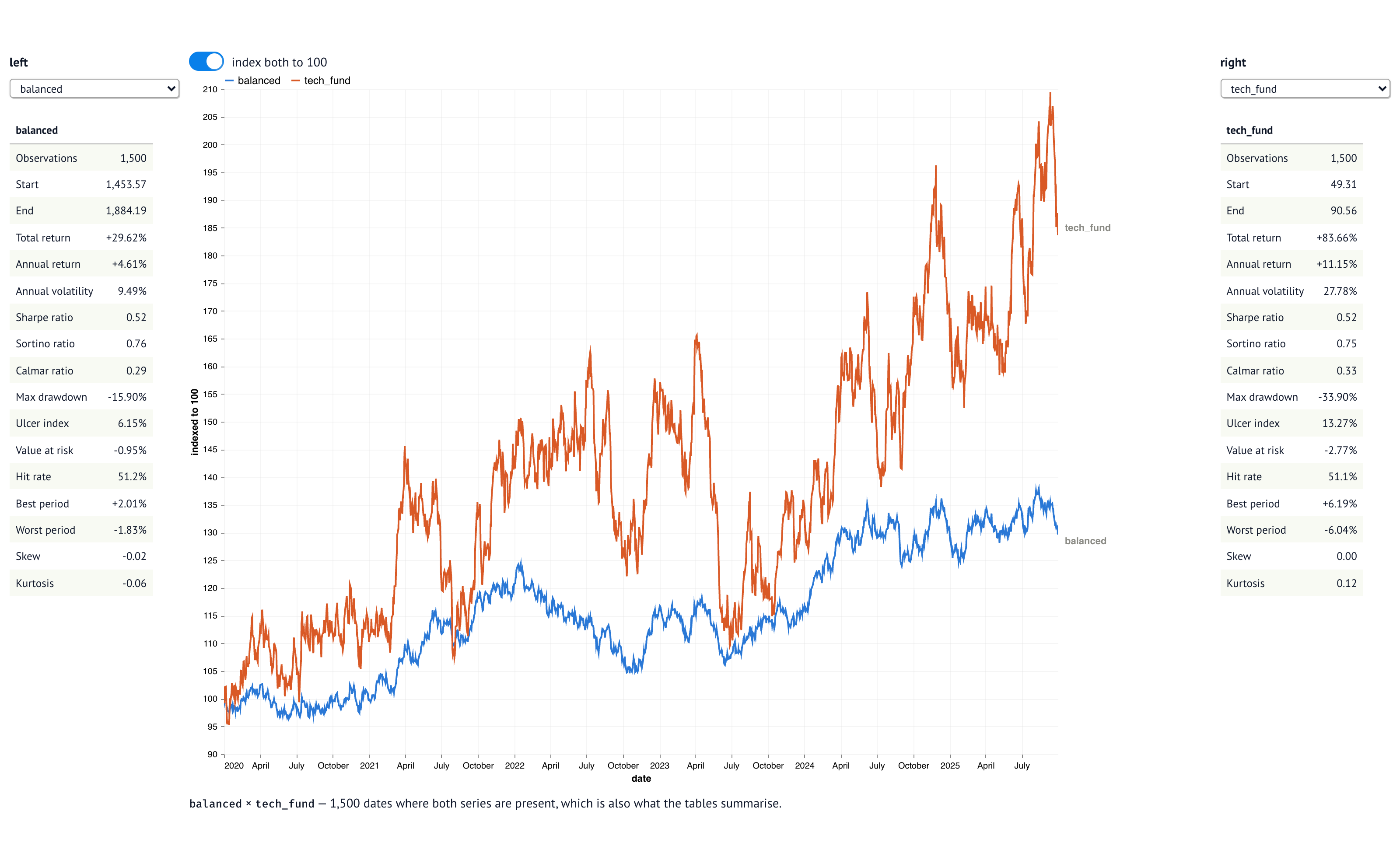
Pick a series on each side. Both are drawn on one pair of axes, and each summary table describes exactly the rows in the plot — the common sample, where both series are present.
The row above the plot cuts that sample down: all, ytd, 12m, 36m, one at a time.
The windows are measured back from the last date in the file rather than from today, so a
file that ends last June still has a year to date. The tables follow the cut, and so does
the indexing — 100 lands at the start of the window.
A second scale would invent a relationship that is not in the data. So both series are indexed to 100 at their first shared date, which is how a fund priced at 49 and one priced at 1,450 become comparable. The switch above the plot turns that off when the levels already share a scale.
jointview |
the generated demo frame |
jointview <file> |
.parquet, .csv, .tsv, .json, .ndjson, .arrow, .ipc, .feather |
--height |
plot height in pixels (default 700) |
--edit |
open the notebook itself, from a clone |
-- … |
everything after a bare -- goes to marimo: -- --port 8080 --headless |
The first date column becomes the x-axis; without one the rows are numbered. Every numeric column is offered as a series.
Neither the chart nor the statistics need marimo. uvx runs the app; to import the
pieces, install the package from PyPI:
uv add jointview # or: pip install jointviewThe package ships a py.typed marker, so the annotations on everything below reach your
own type checker instead of resolving to Any.
Statistics come from jQuantStats, so the
frame carries its period column into summary — the annualisation factor is read from
the spacing of the observations rather than assumed.
from jointview import demo_frame, line_chart, metrics, summary

frame = demo_frame()

table = summary(frame, "balanced", date_col="date")  # a formatted two-column frame
sharpe = metrics(frame, "tech_fund", date_col="date")["Sharpe ratio"]  # the raw number
chart = line_chart(frame, "balanced", "tech_fund")  # a plain Altair chart

print(table.columns, table.height, dict(table.iter_rows())["Max drawdown"])
print(f"{sharpe:.2f}")
print(type(chart).__name__)
['metric', 'value'] 17 -15.90%
0.52
LayerChart
One line per claim above, in the same order — the table is two columns of formatted strings, the metric is a bare float, and the chart is Altair's own type rather than a marimo widget. The block is executed on every commit and its output compared against the result printed here, so a figure that drifts is a failing test rather than a stale README.
Seventeen figures per series — returns, volatility, Sharpe, Sortino, Calmar, drawdown,
Ulcer index, value at risk, and the shape of the period returns. A figure that cannot be
formed shows as — rather than blanking the table.