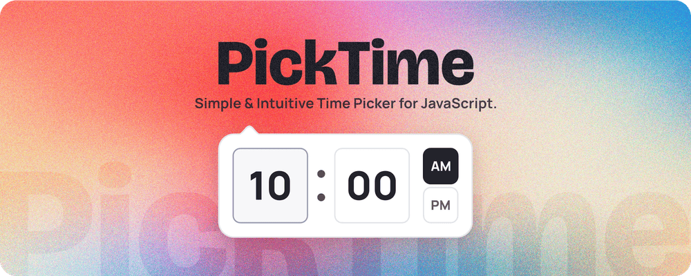


A time picker that behaves like a real form control.
<pick-time> is a form-associated custom element. It submits with the form,
participates in constraint validation, formats itself from the user's locale,
and needs no stylesheet import and no framework wrapper.
<form>
  <label for="start">Start</label>
  <pick-time id="start" name="start" value="09:30"></pick-time>
</form>
new FormData(form).get('start'); // "09:30"- Real form participation via
ElementInternals, soFormData,form.reset(),:invalid, andrequiredwork without a hidden input - Accessible ARIA spinbuttons, a focus trap while the panel is open, screen-reader announcements, and no tab-order hijacking
- Typed entry that accepts what people actually type:
9:30 pm,0930,21:30 - Locale-aware hour cycle and day-period labels, driven by
Intl min/max, including reversed ranges that cross midnight- Top-layer rendering through the Popover API, so no ancestor can clip it
- No stylesheet to import; theming via CSS custom properties and
::part() - Typed, ESM-only, one runtime dependency
npm install picktimeimport 'picktime';That single import registers <pick-time> and brings its styles with it.
<script type="module">
  import 'https://cdn.jsdelivr.net/npm/picktime/+esm';
</script><pick-time name="start" value="09:30" min="09:00" max="17:00"
minute-step="15" hour-cycle="h12" locale="en-US"></pick-time>import 'picktime';
import type { PickTimeElement } from 'picktime';
const picker = document.querySelector('pick-time');
picker.value; // "09:30" - always the machine format
picker.valueAsNumber; // 34200 - seconds since midnight
picker.valueAsObject; // { hours: 9, minutes: 30, seconds: 0, meridiem: 'am' }
picker.min = '09:00';
picker.showPicker();
picker.addEventListener('change', () => console.log(picker.value));value is always HH:mm (or HH:mm:ss with seconds), the same format
<input type="time"> uses. What the user sees is derived from their locale and
never stored, so the display and the value cannot drift apart.
| Attribute | Type | Default | Description |
|---|---|---|---|
value |
HH:mm / HH:mm:ss |
empty | Initial value. Also the value form.reset() returns to. |
name |
string | - | Field name used on submission. |
min |
HH:mm |
- | Earliest allowed time. |
max |
HH:mm |
- | Latest allowed time. Set below min for a range crossing midnight. |
minute-step |
1-59 | 1 |
Minutes per step. |
second-step |
1-59 | 1 |
Seconds per step. |
hour-cycle |
12 | 24 | h11 | h12 | h23 | h24 |
from locale | Clock format. Use 12 or 24 unless you need the edge cases below. |
locale |
BCP 47 tag | browser default | Locale for formatting and labels. |
placement |
top | bottom | left | right |
bottom |
Preferred panel side; flips when it would overflow. |
offset |
number | 6 |
Gap in pixels between field and panel. |
theme |
light | dark |
system | Forces a colour scheme. |
seconds |
boolean | off | Shows a seconds segment. |
animation |
drop | fade | none |
drop |
Panel open animation. |
required |
boolean | off | Empty becomes a validation error. |
disabled |
boolean | off | Disables the control. |
readonly |
boolean | off | Displays the value but blocks editing. |
hour-cycle="12" and hour-cycle="24" cover almost every case. The four CLDR
names exist because locales genuinely disagree about how to show midnight:
| Value | Hours run | Midnight shows as | Used by |
|---|---|---|---|
12 (alias of h12) |
1-12 + AM/PM | 12 AM |
en-US, en-AU |
24 (alias of h23) |
00-23 | 00 |
most of Europe, en-GB |
h11 |
0-11 + AM/PM | 0 AM |
ja-JP |
h24 |
1-24 | 24 |
rare, some ja and it conventions |
Omit the attribute and the locale decides. The hourCycle property always
reports the resolved CLDR name, so hour-cycle="24" reads back as h23.
Every attribute has a matching property. Beyond those:
| Property | Type | Description |
|---|---|---|
value |
string |
Machine-format value, '' when empty. |
valueAsNumber |
number | null |
Seconds since midnight. |
valueAsObject |
object | null |
{ hours, minutes, seconds, meridiem }. |
open |
boolean |
Whether the panel is showing. |
form |
HTMLFormElement | null |
Owning form. |
labels |
NodeList |
Associated <label> elements. |
validity |
ValidityState |
Standard validity state. |
validationMessage |
string |
Message for the current failure. |
| Method | Description |
|---|---|
showPicker() |
Opens the panel. Mirrors <input type="time">.showPicker(). |
hidePicker() |
Closes the panel. |
checkValidity() |
Standard constraint validation. |
reportValidity() |
Validates and shows the browser's message. |
focus() |
Focuses the field. |
| Event | When |
|---|---|
input |
The value changed, including mid-spin. Composed, so it crosses shadow boundaries. |
change |
The value was committed. |
| Key | Action |
|---|---|
| ↓ | Opens the panel from the field |
| ↑ / ↓ | Steps the focused segment |
| Page Up / Page Down | Steps in larger jumps |
| Home / End | Jumps to the segment's minimum or maximum |
| Tab | Cycles segments, trapped inside the open panel |
| Esc | Closes the panel |
| Enter | Commits typed text |
Segments follow the ARIA spinbutton pattern, so screen readers announce the value and its range as it changes.
While the panel is open, Tab cycles the visible segments and wraps rather than escaping to the page behind. Hidden segments are skipped, so a 24-hour picker cycles hours and minutes only. Closing the panel returns focus to the field.
Constraint validation is the platform's, not a bespoke API.
<form>
  <pick-time name="start" required min="09:00" max="17:00"></pick-time>
  <button>Submit</button>
</form>picker.validity.valueMissing; // required and empty
picker.validity.rangeUnderflow; // earlier than min
picker.validity.rangeOverflow; // later than max
picker.validity.badInput; // typed text could not be parsed
form.checkValidity(); // false while any of the above holdOnce the user has edited the field, an invalid value also sets the
user-invalid custom state, so it can be styled without flagging untouched
fields:
pick-time:state(user-invalid)::part(input) {
  border-color: crimson;
}Set max earlier than min to describe a window spanning midnight, matching
the HTML spec for <input type="time">:
<!-- valid from 22:00 through 06:00 -->
<pick-time min="22:00" max="06:00"></pick-time>Styles live in a shadow root, so page CSS cannot break the component and the component cannot leak. Customise through custom properties:
pick-time {
  --pt-foreground: #23232b;
  --pt-background: #fff;
  --pt-accent-color: #9c766d;

  --pt-padding: 10px;
  --pt-border-radius: 12px;
  --pt-border-color: #e4e4e9;

  --pt-field-padding: 12px 18px;
  --pt-field-border-radius: 10px;
  --pt-field-border-color: #e4e4e9;
  --pt-field-background: #fff;
  --pt-field-color: #23232b;

  --pt-input-font-size: 30px;
  --pt-input-border-radius: 6px;
  --pt-input-focus-border-color: #9d9db0;
  --pt-input-focus-background: #f7f7f9;

  --pt-dots-color: rgb(35 35 43 / 0.8);

  --pt-meridiem-font-size: 10px;
  --pt-meridiem-checked-background: var(--pt-foreground);
  --pt-meridiem-checked-color: var(--pt-background);

  --pt-duration: 0.25s;
  --pt-animation: cubic-bezier(0.25, 1, 0.5, 1);
}
The trigger field has its own padding, radius, border and colour tokens
(--pt-field-*), so it can match a host form's rhythm and palette without
changing the panel's geometry. Everything else keeps the exact --pt-* names
v2 used, so an existing v2 theme ports over unchanged - only the selector
moves:
/* v2 */  .picktime--theme-kd { ... }
/* v3 */  pick-time.kd        { ... }
Digits render in their own stack (--pt-numeral-font), defaulting to the
platform's UI monospace with tabular lining figures and a slashed zero, so the
panel does not change width as values step. To match your body font instead:
pick-time {
  --pt-numeral-font: inherit;
}
No webfont is bundled, deliberately: @font-face declared inside a shadow root
does not reliably apply, so shipping one would mean forcing a document-level
font import on every consumer.
Light and dark follow prefers-color-scheme; theme="light" or theme="dark"
overrides that.
For anything the properties do not reach, use ::part():
pick-time::part(input)  { border-width: 2px; }
pick-time::part(picker) { box-shadow: 0 8px 30px rgb(0 0 0 / 0.18); }
pick-time::part(spin)   { font-variant-numeric: tabular-nums; }
Exposed parts: input, picker, spin, hours, minutes, seconds,
separator, meridiem, period, arrow.
The panel itself is always laid out left to right, because a clock reads the
same way in every locale. The element does not set dir on itself; the trigger
field inherits direction from your page as any input would.
Custom elements are framework-agnostic; there is nothing to wrap.
React 19+ passes props and listeners to custom elements natively:
import 'picktime';

<pick-time name="start" value="09:30" onChange={e => setTime(e.target.value)} />
Vue needs the tag marked as custom:
// vite.config.js
vue({ template: { compilerOptions: { isCustomElement: tag => tag === 'pick-time' } } });Svelte, Angular (with CUSTOM_ELEMENTS_SCHEMA), and plain HTML work
without configuration.
The tag is pick-time because the HTML spec requires every custom element name
to contain a hyphen; <picktime> is not a legal custom element. Pick your own
hyphenated name if you prefer:
import { PickTimeElement } from 'picktime/element'; // does not auto-register

customElements.define('picktime-field', PickTimeElement);
Or use the exported helper, which is a no-op if the name is already taken:
import { definePickTime } from 'picktime/element';

definePickTime('picktime-field');
definePickTime also works after import 'picktime' has already claimed
pick-time. A constructor can only back one tag name per registry, so any name
after the first is registered with a subclass.
v2's new PickTime(inputEl, options) still works and now mounts a <pick-time>
next to your input, mirroring the value back so existing reads keep working. It
logs a deprecation warning; prefer the element.
| v2 option | v3 |
|---|---|
clock: 12 | 24 |
hour-cycle="h12" / "h23" |
minuteSteps |
minute-step |
time: { hours, minutes, meridiem } |
value="09:30" |
theme: 'light' | 'dark' |
theme attribute, or custom properties |
offset: { top, left } |
offset attribute |
upDownKeys, wheelSpin |
Always on; removing them was an accessibility regression |
animation |
--pt-duration, --pt-easing |
arrow |
Always shown; hide with ::part(arrow) { display: none } |
picker.getTime |
picker.value, .valueAsNumber, .valueAsObject |
picker.setTime({...}) |
picker.value = '09:30' |
picker.disable() / .enable() |
picker.disabled = true / false |
Behavioural changes worth knowing:
- The input is no longer forced
readonly, so users can type. - Stepping minutes past 59 no longer changes the hour; segments wrap
independently, as they do in
<input type="time">. min/maxmark the value invalid rather than clamping it, matching the platform.- Output is
HH:mmrather than a display string. UseIntlor read the field for a formatted version.
Chrome 114+, Edge 114+, Firefox 125+, Safari 17+.
Set by the Popover API and ElementInternals. Positioning uses Floating UI
rather than CSS anchor positioning, which has no equivalent of shift() and
only reached Firefox in 147.
If this package added value to your project, please consider buying me a cup of coffee. 🙏