Adaptive split/overlay layouts and hinge-aware hooks for foldable devices in React Native. Built for the iPhone Duo: show two panes around the hinge when open, one on the cover screen when closed.
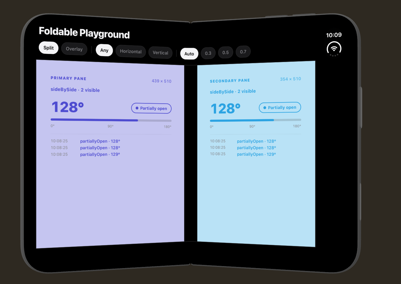
FoldableLayout hands two React subtrees to the platform's adaptive layout engine
(SwiftUI arrangements on iOS 27.1+), which decides how to place them around the hinge.
useHinge exposes the live hinge angle and posture to any component inside the layout.
- New Architecture only. Fabric component with a custom shadow node; no bridge fallback.
- iOS today. Android (Jetpack WindowManager) is next; see docs/roadmap.md.
- Graceful everywhere else. Older iOS and other platforms render a deterministic fallback (primary pane only; overlay layers the primary over the secondary on older iOS) and report the hinge as unavailable. Your app never branches on platform.
yarn add react-native-adaptive-layout
cd ios && pod install
Requires React Native ≥ 0.83 with the New Architecture enabled and Xcode 27.1+ to compile the
adaptive code path. Expo users need a development build (npx expo run:ios); Expo Go is not
supported.
import { Text } from 'react-native';
import { FoldableLayout, useHinge } from 'react-native-adaptive-layout';

export function PlayerScreen() {
  return (
    <FoldableLayout style={{ flex: 1 }} mode="split" axis="any">
      <FoldableLayout.Primary>
        <Video />
      </FoldableLayout.Primary>
      <FoldableLayout.Secondary>
        <Controls />
      </FoldableLayout.Secondary>
    </FoldableLayout>
  );
}

function Controls() {
  const hinge = useHinge();
  return <Text>{hinge.available ? `${hinge.posture} · ${hinge.angleDegrees}°` : 'No hinge'}</Text>;
}| Prop | Type | Default | Notes |
|---|---|---|---|
children |
Primary + Secondary |
required | One of each, any order. Other children are ignored with a dev warning. |
mode |
'split' | 'overlay' |
'split' |
In overlay the primary pane floats above the secondary. |
axis |
'any' | 'horizontal' | 'vertical' |
'any' |
Restricts which axis the system may split on. It never forces a split. |
trackHinge |
boolean |
true |
Gate hinge events for useHinge inside this layout. Layout is unaffected. |
splitRatio |
number |
unset | Primary pane's preferred share in split mode, in (0, 1). See below. |
...ViewProps |
ViewProps |
Forwarded to the container view. |
FoldableLayout.Primary and FoldableLayout.Secondary are slot markers: they render no view of
their own. Give the layout a bounded size (usually flex: 1) and give each pane's root flex: 1.
Hiding a pane never unmounts its React tree, so component state survives posture changes.
For floating controls in overlay mode, give the primary root a transparent background and
pointerEvents="box-none" so touches reach the secondary pane through empty areas.
splitRatio gives the primary pane a preferred share of the layout in split mode, and the secondary
pane fills the rest. The system may override it: on iPhone Duo the split follows the fold when half
open and ignores the ratio; fully open or closed (panes stacked on the cover screen), the ratio
applies. Values outside (0, 1) are ignored with a dev warning. It is ignored in overlay mode and in
fallbacks.
Each slot accepts an optional overlayEdge ('leading' | 'trailing'). In overlay mode the system
may turn the overlay into a side-by-side layout (for example when a foldable is unfolded);
overlayEdge anchors that pane to the given edge when it does. Set it on one slot and the other slot
gets the opposite edge; set neither and the system chooses. It is ignored in split mode and in
fallbacks.
On iPhone Duo the overlay turns side-by-side in the half-open posture, not when fully open. The two display halves are not equal widths, so panes can differ in size depending on the side.
<FoldableLayout mode="overlay">
  <FoldableLayout.Primary overlayEdge="trailing">
    <PlayerControls />
  </FoldableLayout.Primary>
  <FoldableLayout.Secondary>
    <Video />
  </FoldableLayout.Secondary>
</FoldableLayout>
The layout applies no safe-area insets. Place it inside your safe-area container.
Returns the current HingeState of the nearest enclosing FoldableLayout and re-renders on change.
The optional listener receives the initial state and every change; it is always the latest closure
so it needs no memoisation. Throws if called outside a layout pane.
type HingeState =
  | { available: false; angleRadians: null; angleDegrees: null; posture: 'unknown' }
  | {
      available: true;
      angleRadians: number;
      angleDegrees: number;
      posture: 'unknown' | 'closed' | 'partiallyOpen' | 'fullyOpen';
    };
Checking hinge.available narrows the angles to number. Posture is reported by the OS and never
inferred from the angle. Unknown postures from future OS releases surface as 'unknown'; a hinge
whose angle cannot be read is reported as unavailable.
Like useHinge, but returns a derived value and re-renders only when it changes. The angle updates
continuously while the hinge moves, so components that only care about posture should select it:
const posture = useHingeSelector((hinge) => hinge.posture);
const isFlat = useHingeSelector((hinge) => hinge.posture === 'fullyOpen');
Values are compared with Object.is by default. If the selector returns a new object, pass a
comparison as the second argument. Inline selectors are fine. Throws if called outside a layout
pane.
Returns how the system actually arranged the panes, measured natively, and re-renders when it changes:
interface Arrangement {
  kind: 'unknown' | 'single' | 'sideBySide' | 'stacked' | 'layered';
  size: { width: number; height: number } | null;
  primary: { visible: boolean; frame: Rect | null };
  secondary: { visible: boolean; frame: Rect | null };
}
Frames are in the layout's coordinate space; a hidden pane has frame: null. kind comes from
geometry alone, so an overlay that turned side by side reports sideBySide, like a split. Use the
selector form to re-render only for what you read:
function DetailHeader() {
  const detailAlone = useArrangementSelector((a) => a.kind === 'single');
  return detailAlone ? <BackButton /> : null;
}
In fallbacks the arrangement is single with only the primary visible, except overlay on older iOS,
which reports layered. Throws if called outside a layout pane.
Components that call useHinge or useHingeSelector throw outside a layout pane. In unit tests,
wrap them in HingeTestProvider from the testing entry instead of rendering a native layout:
import {
  createArrangement,
  createHingeState,
  HingeTestProvider,
} from 'react-native-adaptive-layout/testing';

render(
  <HingeTestProvider hinge={{ posture: 'partiallyOpen', angleDegrees: 90 }}>
    <Controls />
  </HingeTestProvider>,
);
Re-render with a new hinge to simulate folding; subscribers update as they do on device. Omit
hinge (or pass null) for "no hinge". createHingeState(input) builds a HingeState from the
same shorthand for testing listeners and selectors directly.
Pass arrangement={createArrangement('sideBySide')} to drive useArrangement (it defaults to
unknown). Rendering FoldableLayout itself needs the native component and is not covered.
The package ships ES modules. With Jest's React Native preset, add it to transformIgnorePatterns:
transformIgnorePatterns: ['node_modules/(?!((jest-)?react-native|@react-native(-community)?|react-native-adaptive-layout)/)'],| Environment | Layout | Hinge |
|---|---|---|
| iOS 27.1+ (Xcode 27.1+ SDK) | Native adaptive split / overlay | Live |
| iOS < 27.1, or older SDK | Primary only (split) / layered (overlay) | Unavailable |
| Android, web | Primary only, secondary mounted hidden | Unavailable |
yarn
yarn example prebuild
yarn example ios
Open the iPhone Duo simulator from Xcode 27.1+ to see the split behaviour and hinge angle.
See CONTRIBUTING.md and docs/architecture.md. Design decisions live in docs/adr.
MIT © Sambulo Senda